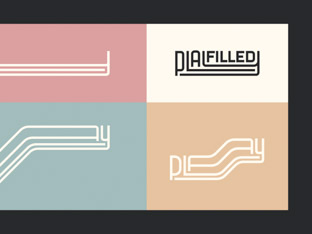
Playfilled
Shifting beliefs around play. We created a fluid visual identity to express playfulness and resilience for an experimental people consultancy.
The founder of URTA reached out to Brand Purist to develop a new footwear brand inspired by London’s creative diversity.
We created a brand identity that represents a fusion of cultures and seeks to resonate with a young, fashion-savvy Chinese audience.
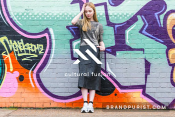
“I wanted to create a brand that would be a bridge between Europe and Asia. I founded URTA to provide shoes that would enable people of my generation to express their individual style.”
To attract a young Chinese audience aged 18-30 who are open to new influences, the brand needed to be a trendsetter, celebrating and inspiring individualism. We focused the brand identity on Shoreditch, a creative hub in multicultural London.
Learn more about our brand research serviceURTA celebrates individuality through future-focused fashion. Its brand values of being Progressive, Bold, and Collective express the exploration of the unbeaten path, inspiring fearlessness, and bringing individuals together into an inclusive movement.
Although URTA is a subsidiary of an established Chinese company, it was important to position it as a standalone footwear startup to allow it to follow its own trajectory.
Learn more about our brand strategy service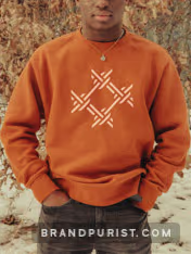
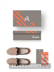
Industrial aesthetics, street art, geometric fonts, and bold graphics influenced our final output. We selected orange as the brand colour for its energy and underutilisation among fashion brands. The brand design strives for simplicity and impact.
Learn more about our brand design service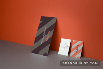
The logomark is a combination of the letters “U” and “A”. It is made up of four individual pieces that give the impression of interlocking characters. The symbol lends itself to applications on footwear and clothing.

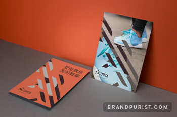
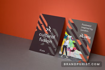
The prominent orange colour is complemented by dark brown and grey to create a balanced look for the visual identity. When the logomark is used in patterns and other graphic artworks, it becomes a distinct, ownable brand asset.
Learn more about our visual identity service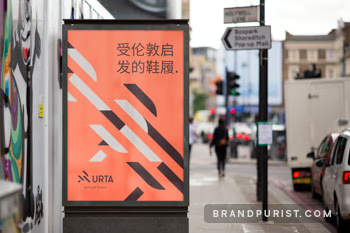
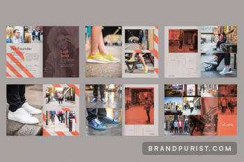
We photographed lookbook and lifestyle images in Shoreditch, capturing the brand’s original, gritty, urban inspiration.
To emphasise the Shoreditch connection of the brand, each pair of shoes was named after streets they appeared on in the photos.
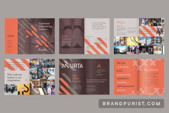
The brand book tells the origin story of URTA. The grid-based typographic layout is combined with vibrant images of Shoreditch and bold graphics.
We created URTA’s interactive website, featuring its brand ethos, lookbooks and products. Our partners at Octophin Digital built the site, bringing our designs to life exactly as intended.
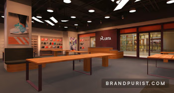
Learn more about our web design serviceURTA commissioned design concepts for their Shanghai store in preparationfor the brand launch. The visuals utilise URTA’s logo, lifestyle photography, graphic patterns, and the brand’s signature colour palette.
Learn more about our store design service
URTA’s brand guidelines summarise the brand strategy, including purpose, core values, and personality. They provide clear guidelines for logo, typography, and colour usage.
Learn more about our brand guidelines service