
Huddle
An international identity that reflects partnership, team spirit and sports. We worked with gaming industry veterans to launch their tech startup brand.
Fliff, a US-based startup, offers a more inviting, more social alternative to traditional sportsbooks.
Our collaboration with Fliff began with a brand sprint focused on distilling their brand strategy and elevating their visual identity.
The initial sprint was a great success and we continue to support Fliff on their branding journey. The designs on this page reflect this evolving work, and go beyond the deliverables of a brand sprint.
“We now have a complete identity that can be applied across any asset and have gotten overwhelmingly positive feedback from our team, investors and, most importantly, our users.”
We dissected their existing identity and brands they aspired to be like. We took the team through exercises that explored different aspects of branding to reveal opportunities for improving their own brand.
We identified that the brand needed to attract casual and novice gamers, and it also had to appeal to existing users, investors and Fliff’s growing team.
Learn more about our brand research serviceA clear identity is the foundation of a strong brand. We defined Fliff’s purpose, core values, personality and ambitions.
Learn more about our brand strategy service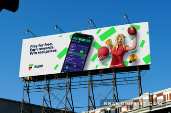
“We came to Brand Purist to create a new visual identity, but the sprint process went much beyond that in also helping us refine our core values and vision for the brand.”
The word ‘fliff’ is a slang term for money that is easily spent. It’s not a widely recognised expression, so it was important to reflect the name’s meaning through design. We ran a series of sprints to arrive at an outcome that inspired everyone.
Learn more about our brand design serviceThe logo mark is a stylised depiction of a wallet and a green bank note, which together form the letter F. The Fliff team provided the early designs for the logo. We fine-tuned the symbol and redesigned the wordmark.
We worked closely with the Fliff team to develop their colour palette and typographic style. After the name and brand mark, it felt like a natural progression to build the visual identity around the money element of the logo.
We designed a range of patterns using vibrant green rectangles against a navy background. This created a simple yet striking visual language. The rectangles behave like cash. They often appear to be falling randomly from the sky. But they can also be lined up neatly as if they were coming off the printing press. By reducing our money symbol to a basic shape, we achieved a modern, timeless look.
Learn more about our visual identity service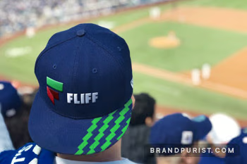
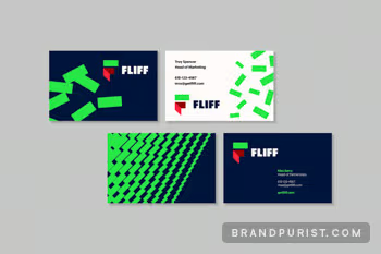
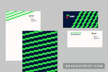
Our initial sprint deliverables included logo assets, e-signatures, stationery, website, copywriting and social media assets. Many of these items have been updated and superseded by new work as we’ve evolved the brand throughout the years. For example, we used stock illustrations to meet the strict deadlines of the sprint process. Later on we supported the Fliff team with creative direction to develop their original 3D characters.
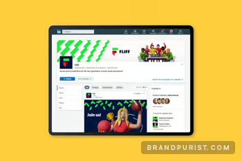
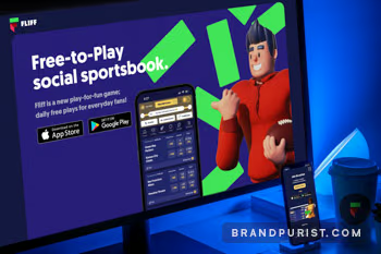
We designed a bespoke, customer-facing website for Fliff. The brand comes to life through interactivity, 3D characters, vibrant colours and animation.
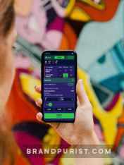
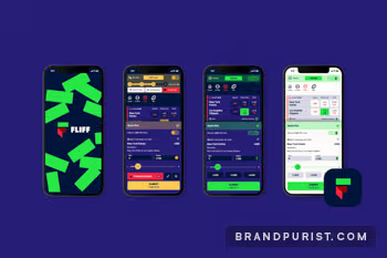
Learn more about our web design serviceIt was vital to create a visual identity that could be applied to the existing Fliff app. We tested a wide range of colour palettes, created light and dark modes and designed splash screens. The Fliff team was also provided with guidance on how to implement the new brand on their app.
We summarised the brand identity and the foundations of the visual language in a brand book. Many people will interact with Fliff’s brand in the coming years as the company grows. Guidelines will be essential to maintain clarity and consistency.
Learn more about our brand guidelines service