Fliff
A brand to excite gamers, investors and talent. We distilled the brand strategy and elevated the visual identity for this social sportsbook startup.
We worked with gaming industry veterans to launch their software startup brand. The brand identity needed to attract tech talent, reassure investors and distinguish Huddle from competitors.
The branding process was conducted online, with team members in New York, London and Zagreb.

“What a ride! We would strongly recommend Brand Purist’s brand sprints for any startup out there. You really learn a lot about who you are and bond even more as a team.”


The team had a deep experience of working in the industry, so dissecting the brands of their past companies was especially insightful.
Workshops helped the participants broaden their knowledge of their audiences, competitors and different aspects of branding.
Learn more about our brand research serviceWe clarified the brand identity during the strategy phase, including the brand purpose, core values, personality and desired positioning.
Learn more about our brand strategy service
The gaming industry is expected to keep growing, but face increased regulation around the world for the foreseeable future. Playing audiences are also getting younger, and are more open to new gaming experiences. Huddle is building a flexible, modular software, which is an ideal fit for this kind of environment. We captured this notion in the brand positioning too. Huddle is the only software provider ready to adapt to the fast-changing needs of gaming operators.
Learn more about our brand positioning serviceThe core purpose sums up Huddle’s aspirations: Huddle will empower the gaming industry to thrive in a rapidly evolving world. The founders wanted their brand to feel visionary, so we captured this in the broader brand identity. But we also highlighted that a brand purpose should feel grounded. The result is a purpose that’s meaningful to Huddle’s staff and clients. And it can stay relevant as the business grows.
Learn more about our brand purpose service
The design phase began with generating visual concepts, led by the brand identity and name. The Huddle team fed into the process by collecting inspiration and forming a design brief. Together we set the criteria that our design solution had to meet.
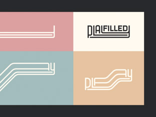
Learn more about our brand design serviceWe picked a font that would add personality and accentuate the appealing form of the brand name. The logo was completed with a simple, elegant mark to sum up the essence of Huddle. Our logo design:
The logo inspired a range of expressions that can suit different audiences and applications. The graphic artworks build on the logo mark by adding a sense of movement. Gradient colours create depth, and a hint of coral adds energy. We used the deconstructed shapes of the mark to connect illustrations to the brand.
Learn more about our visual identity service
The initial brand implementation phase produced the assets which were essential to launch the Huddle brand. We delivered:


Huddle’s offering needed to be communicated carefully. The brand’s authentic and empowering tone of voice had to avoid jargon and marketing speak. Attracting talent was more important than selling the software at this stage of Huddle’s journey. So we emphasised their inspiring vision and culture throughout their brand messaging.
Learn more about our brand messages serviceThe visual identity was pushed further on Huddle’s website. Typography, colours, icons, illustrations, layouts and other design elements all come together cohesively.
Learn more about our web design serviceWe cemented the foundations of Huddle’s brand in a brand book. It summarises the identity, including the brand purpose, values and personality. It also gives guidelines for logo, typography and colour use.
Learn more about our brand guidelines service
A brand to excite gamers, investors and talent. We distilled the brand strategy and elevated the visual identity for this social sportsbook startup.

Always evolving the brand of a global, fashion-savvy software company. We are the brand transformation partner of the product customisation pioneer.
Reshaping the preconceptions about consultancy. We partnered with business transformation experts to create a mould-breaking, dynamic brand.
Shifting beliefs around play. We created a fluid visual identity to express playfulness and resilience for an experimental people consultancy.