Brand Purist, your logo design partner
Brand Purist is a London-based branding agency working and design studio with startups and small businesses globally. We design timeless, on-brand logos that embody your business identity and help you stand out. Discover how we can help your organisation grow through the power of branding and design.
What is a logo?
A logo is a visual symbol used to identify a company, product, or brand. It’s a unique design, often including text and images, that represents the essence of a brand. A well-designed logo helps to establish a brand’s identity and makes it easily recognisable to the public.
What is the purpose of a logo?
The purpose of a logo goes beyond mere identification. The logo can also become a vessel of complex ideas. As people interact with a brand and gather positive or negative experiences, they start to associate the logo with those experiences.
Just as a certain colour evokes a certain feeling, logos can also act as powerful emotional triggers. Seeing the logo of your favourite brand will fill you with warmth. The opposite is true when you come across a brand that you dislike. This is rooted in evolution. Telling apart poisonous plants from edible ones or spotting a predator in a blink of an eye meant the difference between survival and demise for our prehistoric ancestors. The logo today, helps us tell apart the good from the bad – at least from our subjective perspective.
Why logos matter in branding
Symbols can signal tribal allegiance too. Flags and heraldry were used to rally people behind a cause, represent belonging to a group, or express shared values. Logos play a similar role for brands trying to build tribes of loyal followers.
The logo is the most important visual asset of a brand. It often acts as inspiration for other expressions, such as icons, patterns, illustrations or animations. Certain features of the logo – if they’re recognisable – can become decorative elements used throughout the visual identity.
Logo vs. visual identity vs. brand
The logo is a piece of design that is meant to capture the essence of your brand.
The visual identity is a coherent system of visual assets. It includes the logo but also other elements: shapes, colours, typefaces, layouts, icons, images and so on.
At Brand Purist, we tend to use the term ‘brand identity’ to refer to the value system (brand purpose, core beliefs, personality, etc.). But it is not uncommon to include the visual and verbal identity under this umbrella term.
Different types of logos
There are various types of logos, each with its unique characteristics and uses. Understanding these types helps in choosing the right logo that aligns with your brand’s identity and message.
Literal or abstract
Logos can be a literal representation of the brand name or what the company does, conveying an exact meaning. Or they can be abstract – open to a range of interpretations and with a more deeply hidden meaning.
Typographic or pictorial
Visually, logos can be typographic or pictorial, or a mixture of both. The full brand name, monograms or acronyms can be turned into unique wordmarks or typemarks. Pictorial marks or symbols can express ideas through visual metaphors, analogies or abstractions.
Our logo design process
At Brand Purist, our logo design process is thorough and collaborative. We start by understanding your organisation: its values, mission, target audience, competitors and your vision of the future. Workshops give you and your team the opportunity to share ideas and define the visual direction of your brand.
Brand Purist explores a wide range of ideas before presenting you with the solution that we think best solves your challenge. We don’t believe in presenting multiple options because that approach can easily dilute strong ideas. After gathering feedback and making any necessary revisions, we’ll arrive at the final design. Our goal is to create a logo that truly represents your brand and resonates with your audience.
Our logo design philosophy
Logo design for us is a balancing act. Your logo will have more impact if it has meaning. Keeping the number of elements to a minimum makes the message clearer and the logo more memorable. ‘Less is more’ is a rule to follow, but expressing your brand personality is just as important. The design should also allow your organisation to pivot without leading to confusion or frequent redesigns.
Logo design is a delicate balance of meaning, simplicity, originality and flexibility.
Logo design examples
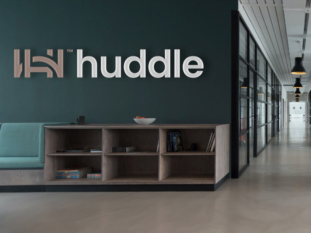
Huddle: gaming tech startup
Brand Purist picked a font that would add personality and accentuate the appealing form of the brand name. The logo was completed with a simple, elegant mark to sum up the essence of Huddle. Our logo design:
- Captures collaboration and partnership,
- Expresses the idea of moving over obstacles,
- Is elegant so that it can work as a mark of excellence,
- Is unobtrusive so it can stand on its own or with partners’ brands,
- Incorporates the classic American football goal post for the letter H,
- Alludes to other sports with the half circle (e.g. basketball court),
- Can be seen as a literal huddle, with the arch reaching over the goal post,
- Symbolises the four founders with four vertical lines.
Playfilled: people consultancy
Brand Purist explored many logo concepts. Traditional design approaches didn’t feel right because any specific mark would have conveyed a singular view of play. We needed to break rules to match the daring, experimental nature of Playfilled. The final logo design:
- Represents resilience and evolution by being dynamic and able to change,
- Captures the idea that play means something different for everyone,
- Expresses playfulness without being childish,
- Features interlocking, elongated letters to imply collaboration and journey,
- Creates space for the word ‘filled’ within the word ‘play’, alluding to Playfilled facilitating a safe environment for self-discovery.
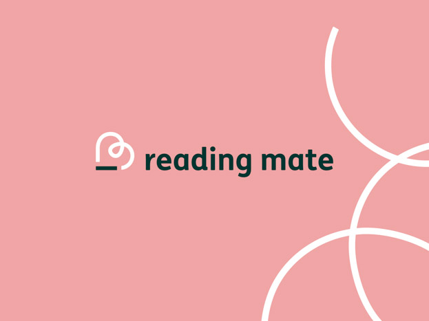
Reading Mate: edtech startup
The Reading Mate logo mark is a simplified depiction of a human holding a tablet. The shape as a whole looks like a heart while it also alludes to an underscored letter ‘R’ - meant to emphasise the importance of reading.
Examples of logo redesign
The Foods of Athenry: free-from baked goods
Brand Purist modernised the farmhouse mark of The Foods of Athenry’s logo. The new logo played a pivotal role in redefining the brand’s positioning, lifting its image and instilling trust in consumers.
One Small Pixel: creative studio
While the original logo mark was effective in its simplicity, it felt static. Instead of allowing the large square to overshadow the small pixel, Brand Purist reimagined it to depict the small pixel pushing through the large one. We rounded the corners of the large square to make the logo feel friendlier.
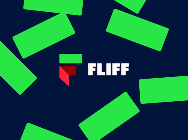
Fliff: social sportsbook
The logo mark is a stylised depiction of a wallet and a green bank note, which together form the letter F. The Fliff team provided the early designs for the logo. Brand Purist fine-tuned the symbol and redesigned the wordmark.