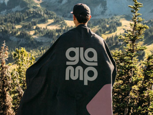
Glamp
Creating an adventurous brand with community at its heart. Disrupting the preconceptions of glamorous camping and appealing to a young, eclectic audience.
Reading Mate, an edtech company, develops software tools aimed at fostering a lifelong love for reading in children. They believe that reading is the key to giving every child the best chance in life.
We teamed up to bring clarity to their brand communications, align their team members along a single vision, and create a brand that matched their inspiring cause.

“We’re absolutely delighted with the outcome and feel like we have so much more clarity as a business and team. Couldn’t recommend highly enough!”


The research phase helped us understand the target audiences, including school leaders, teachers and parents. Each of these groups had unique perspectives on reading, all sharing a common goal - to encourage children to read more, albeit for different reasons.
We ran several workshops and collaborated closely with the Reading Mate team to dissect their branding and that of its competitors.
Learn more about our brand research serviceReading Mate inspires a love of reading to give every child the best chance in life.
Distilling the essence of the brand was the next step in our process. We refined the brand identity to reflect an ambitious startup with an impactful social purpose.
We needed to clearly express Reading Mate’s operations, their methodology, and how they address the pain points of their users. So we crafted their key messaging. Where it was appropriate, we dialled up creativity through copy evoking children stories.
The brand architecture was also updated. Reading Mate’s software product was renamed to Reading Hub and given a logo lockup, signalling a parent/sub-brand relationship.
Learn more about our brand strategy service
The design phase was an intricate task. After exploring various ideas, we landed on an abstract yet meaningful solution.
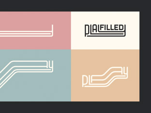
Learn more about our brand design serviceThe logo mark is a simplified depiction of a human holding a tablet. The shape as a whole looks like a heart while it also alludes to an underscored letter ‘R’ - meant to emphasise the importance of reading.
The Reading Mate logotype is presented in lowercase to convey a sense of humility. We designed the logo in a way that it’s easy to add new services and products under the umbrella. We also created lockups for Reading Hub – one of their core services.

A vibrant colour palette enhances the brand’s appeal to young learners, adding an element of fun. The curved lines of the logo lend themselves to inventive applications. The resulting artworks are easy to recognise as part of the Reading Mate brand.
We selected two brand typefaces, one simple, easy-to-read sans-serif font, and a more ornamental display font that evokes the character of old storybooks.
Our initial project scope involved a foundational implementation. After finalising the design direction, we started assembling the deliverables which included logo assets, e-signatures, business cards, brand guidelines and website designs.
Learn more about our brand implementation serviceWe expanded the brand by using curved lines, illustrations, icons, and creative typography, ensuring a cohesive style inspired by the logo.
Our focus was on the core pages that were meant to serve as a guide. The Reading Mate team then expanded on our designs and built the site themselves.
We used the same palette but shifted the emphasis to different colours within it to achieve a visual distinction between Reading Mate and Reading Hub.
Learn more about our web design service

We wrapped up Reading Mate’s branding project by formulating comprehensive guidelines. It covers everything from brand identity and core values to specific rules for logo usage, typefaces, colours, and illustrations. This document is Reading Mate’s brand cornerstone, helping them promote literacy in a consistent and engaging way.
Learn more about our brand guidelines service
Creating an adventurous brand with community at its heart. Disrupting the preconceptions of glamorous camping and appealing to a young, eclectic audience.
A brand to excite gamers, investors and talent. We distilled the brand strategy and elevated the visual identity for this social sportsbook startup.
Shifting beliefs around play. We created a fluid visual identity to express playfulness and resilience for an experimental people consultancy.
Reigniting a creative studio’s spark by sharpening brand values, producing inventive messaging and energising the visual identity.