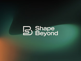
Shape Beyond
Reshaping the preconceptions about consultancy. We partnered with business transformation experts to create a mould-breaking, dynamic brand.
We were invited by Octophin Digital, digital and social media consultants, to help their client, The Foods of Athenry, refocus their brand purpose and modernise their visual identity.
Our objective was to create a more memorable brand by overhauling the visual identity, which included redesigning the logo and refreshing the look of all product ranges.


The Foods of Athenry is a family-run business. The founders had a special attachment to their brand because it was built with love and hard work over many years.
A couple of crucial issues emerged through our research: the brand lacked a focused purpose and consistent visual identity. We also explored the company’s history, customers and competitors.
There are many established brands in the free-from baked goods sector. We helped the The Foods of Athenry team gain a better perspective on areas to improve by deeply analysing competitors’ branding and design approaches.
Learn more about our brand research serviceOne of the key challenges of the project was evolving the brand while ensuring its heritage and soul was retained. We worked closely with the team to define the brand identity, including: core purpose, values, personality, positioning and vision.
Learn more about our brand strategy service

The founders had personal experience of struggling to find tasty products that were free from artificial and allergy-inducing ingredients. This had led them to create healthy, delicious treats for themselves. We made sure this shaped the brand from the start.
The concept of enabling people to experience food freedom became the brand’s purpose. And we brought the business’ positive values into the centre of their brand identity. The Foods of Athenry is invested in people, family-oriented, caring and health-conscious. Staying true to their roots is a key ingredient in the brand’s distinctive charm.
Learn more about our brand purpose service
Our visual research resulted in a long list of improvements to the overall look of the brand. We addressed inconsistencies across all facets of the design by:

We modernised the farmhouse mark of The Foods of Athenry’s logo. We refined how the name appeared next to the mark, to make sure the balance was right. The new logo played a pivotal role in redefining the brand’s positioning, lifting its image and credibility.


Some elements of the existing visual identity were diluting the brand. We identified features to keep, and reinvented the look based on a single typeface and a handful of brand colours. We reserved purple for the overarching brand and assigned unique colours to each product to give them personality.
Learn more about our visual identity service
We needed to create a more coherent look for the whole product family. Bringing the designs closer to each other was intended to help consumers identify product ranges easily on busy shelves.
Learn more about our packaging design service

We wrapped up the project by producing a detailed brand guidelines document. This covered: brand identity, core values, naming, taglines, logo usage, typefaces, font sizes and weights, information hierarchy, packaging layouts, photography style and rules, colours, illustrations, symbols and more.
Learn more about our brand guidelines service
Reshaping the preconceptions about consultancy. We partnered with business transformation experts to create a mould-breaking, dynamic brand.
Impactful visual identity showing the power of clear communications. We designed a brand for a creative agency for charities and ethical businesses.

Always evolving the brand of a global, fashion-savvy software company. We are the brand transformation partner of the product customisation pioneer.
An international identity that reflects partnership, team spirit and sports. We worked with gaming industry veterans to launch their tech startup brand.