Shape Beyond
Reshaping the preconceptions about consultancy. We partnered with business transformation experts to create a mould-breaking, dynamic brand.
The International Council of Design, formerly Icograda, in partnership with JCDecaux, organised a global competition to celebrate Icograda’s 50th anniversary on World Communication Design Day.
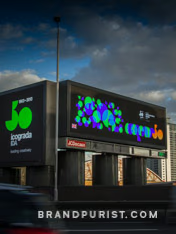
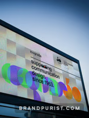
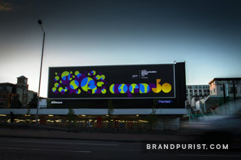
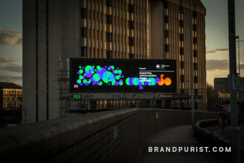
Advertising space along London’s Cromwell Road was taken over by creatives for a weekend. Our winning designs were showcased on multiple LED and traditional printed billboards on one of Europe’s busiest roads, reaching an estimated 350,000 people.

“JCDecaux is committed to working with the very best creative design talent. We are delighted to be playing a key part in celebrating World Communication Design Day with 50 creatives from 50 designers from 5 continents across the globe.”
Designers and creatives from around the world were invited to submit their interpretation of the theme ‘1Love/1Word’ to honour the International Council of Design (formerly Icograda) and its 50 years of service to the design community.
‘1Love1Word’ captures the spirit of Icograda. It represents finding congruity in difference and accord in divergence. It is love as a creative force and design as a communitarian practice — a collaborative, pioneering drive for accessible and sustainable design.
The inclusion of Icograda’s 50th anniversary logo was mandated by the brief. Created by Fabrica, the Benetton Group’s communication research centre, the symbol was inspired by old world maps structured on dual globes. The complete view of all continents references Icograda’s mission to support all design cultures globally.
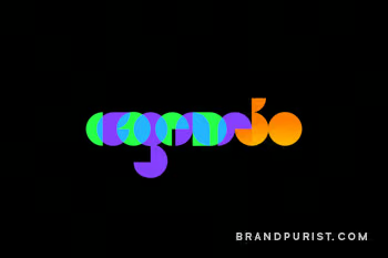
Our approach evolved and expanded the logo to create a cohesive visual identity, while staying true to Fabrica’s design. We used the partial circles of the 50 mark to construct a minimalist Icograda wordmark in a matching style. The overlapping letters emphasise the idea of bridging gaps and collaboration. The letters, coming from the same source but still looking distinct, represent the notion of ‘accord in divergence’.
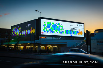
Using the same basic components, we also developed a pattern that abstractly represented human diversity and communication. The shapes are all different, yet their shared features are also evident. Their connections and their rhythm underline the strength that lies in unity.
Minimalist graphics, vibrant colours, and a simple layout provide a throughline between the design ethos of the 60s and today, signifying Icograda’s first 50 years.
