Shape Beyond
Reshaping the preconceptions about consultancy. We partnered with business transformation experts to create a mould-breaking, dynamic brand.
We worked with former corporate leaders to create the brand for their experimental people consultancy.
Playfilled unlocks human potential and builds resilience through the power of play. The visual identity is centred around a playful, flexible logo. This captures the founders’ desire to reinterpret the meaning of play in adulthood.
“We loved working with Brand Purist. Their brand sprints offering was exactly what we needed as a startup. We’re so happy with the quality of the result. Highly recommended!”
“Bence kept us on track, moving quickly, but never feeling rushed. He added so much value in clarifying our message, with great attention to detail while keeping the overall vision in mind. We’re so happy with the quality of the result. Highly, highly recommended!”
A key element of the research phase was empathising with the target audience. We came to understand that business leaders’ challenges often revolve around resilience, innovation, motivation and wellbeing.
We also dissected the brands of organisational design, business transformation and people consultancies to find ways to differentiate Playfilled.
Learn more about our brand research serviceOur aim was to create a brand identity that goes beyond fueling a business consultancy. It needed to align with the founders’ bold plan to inspire a movement around purposeful play. The Playfilled team was very engaged with our process and contributed many ideas. We helped distill their thoughts into a coherent brand strategy.
Learn more about our brand strategy serviceThe founders’ personal experiences of working in the demanding yet unfulfilling corporate world drove them to start Playfilled. They have a deep desire to reimagine the experience of work, fix broken systems and shift beliefs around play. This is captured in their brand purpose: We heal the world by unlocking the power of play.
Learn more about our brand purpose serviceWe gathered visual inspirations and generated concepts for the visual brand. Playfilled then summed up their requirements in a design brief. We had to aim for a subtle form of playfulness, which also conveyed substance.
Learn more about our brand design serviceWe explored many logo concepts. Traditional design approaches didn’t feel right because any specific logo mark would have conveyed a singular view of play. We needed to break some rules to match the daring, experimental nature of Playfilled. The final logo design:
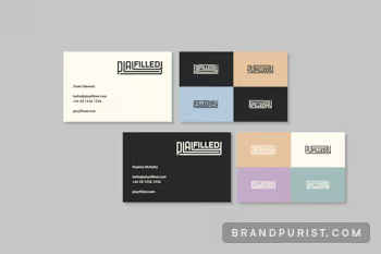
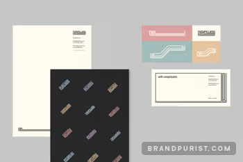
The flexible logo is integral to the visual identity. The word mark can take many forms and can be used for different artworks and patterns. When its shapes are stretched, they create a sense of movement. The word ‘play’ can act as a frame for content and images. The logo also lends itself to animation, which will be key as the brand expands.
We picked a clear font that compliments the logo’s custom type design without distracting from it. The colour palette avoids bright, primary colours that are typically associated with children and play.
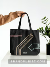
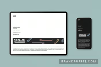
We designed a range of branded items to help Playfilled launch quickly: logo assets, e-signatures, stationery, website, social media profiles, brand guidelines, icons, animations.
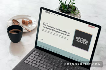
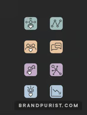
Typography, colours, icons, illustrations, layouts and other design elements all come together cohesively on Playfilled’s website. Designing it helped us flesh out the visual identity. We also developed a simple human icon to emphasise the people-centric aspect of Playfilled’s services.
Learn more about our brand implementation serviceWe needed to carefully articulate the value play can deliver to organisations and individuals without sounding too sciency or lofty. The language had to be inviting, insightful and a little bit cheeky to reflect the brand’s personality.
Learn more about our brand messages service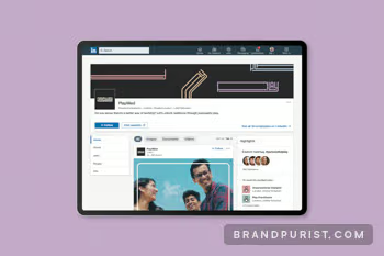
To help Playfilled launch a crowdfunding campaign, we built a fresh landing page. We used Webflow to go from concept to launch in a matter of weeks.
Learn more about our campaign website serviceWe wrapped the first round of brand sprints up by producing a brand book. It captures the brand identity and essential rules for the visual identity. It’s a document that is meant to evolve as we build out the brand. We continue to assist Playfilled through branding as they work to fulfill their mission.
Learn more about our brand guidelines service