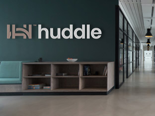
Huddle
An international identity that reflects partnership, team spirit and sports. We worked with gaming industry veterans to launch their tech startup brand.
GivingWays combines various ways of giving to charities into a single online platform. Raffles, auctions, volunteering, and many other opportunities are reimagined to encourage a younger demographic to support good causes.
Brand Purist developed a meaningful brand name and a flexible brand identity. Built around an unconventional logo, GivingWays’ visual identity reflects the brand’s transformative and playful nature.


GivingWays had a different brand identity when they first approached us. Their existing name and logo posed a potential barrier to attracting their desired audience – young people under thirty, who are less likely to support charities than previous generations.
Extensive desk research, persona, and empathy mapping exercises helped uncover the target audience’s needs. Young people yearn for recognition and responsibility but see charities as dated and uninspiring.
Learn more about our brand research serviceIn response to research insights, we distilled GivingWays’ brand values to set them apart from the competition.
Combined, these core ideals represent what GivingWays believes in and offer a foundation for a brand identity that could disrupt the market:
Finding a meaningful name that was also available as an authoritative .com domain demanded intensive exploration. GivingWays met all our criteria, inspiring messaging and jump-starting visual design.
Learn more about our brand naming service


It’s a rare opportunity when a brand name seamlessly translates to a visual representation.
We designed a flexible identity system that expresses the meaning behind the GivingWays name in a playful, yet unconventional manner.
Learn more about our brand design serviceAfter selecting a geometric typeface with a friendly personality, we designed a neat GivingWays logotype. We also took the G.W. initials and connected them with simple lines to create a distinct and innovative mark. It’s an effortless interpretation of the name and how the GivingWays platform connects donors with charities.
The fluid logo can adapt to its surroundings, signifying the platform’s game-like experience and the wide-ranging ways people can support charities.
Learn more about our logo design serviceThe logomark’s aesthetics can be translated into a unique typeface design. We constructed a cursive font with a clear visual connection to the logo.
The GivingWays mark can be used creatively as a background pattern or framing device for images. The three lines inspired by the logo, and the prominent white-blue, duotone colour palette ensure a cohesive visual identity that grabs the target audience’s attention.
Learn more about our visual identity service
After the proposed name, tagline and design approach were signed off, we began designing the GivingWays online platform. Months of close partnership with the development team followed to bring to life the founder’s vision.
Learn more about our brand implementation serviceWe delivered the platform’s interface visuals, complete with a unique type design, icons and patterns. We liaised with the developers to implement our designs, providing detailed specifications and guidance.
Learn more about our web design serviceWe developed a bespoke icon style matching the logomark’s rounded and linear aesthetics. Icons help break up written content, add visual interest, and aid navigation on GivingWays’ platform.
An international identity that reflects partnership, team spirit and sports. We worked with gaming industry veterans to launch their tech startup brand.

Reimagining the brand of a PR firm with a distinct flavour. Illustration and typography-driven visual identity for a personable and insightful company.
Reshaping the preconceptions about consultancy. We partnered with business transformation experts to create a mould-breaking, dynamic brand.

Always evolving the brand of a global, fashion-savvy software company. We are the brand transformation partner of the product customisation pioneer.