
Shape Beyond
Reshaping the preconceptions about consultancy. We partnered with business transformation experts to create a mould-breaking, dynamic brand.
Aniseed PR is a boutique agency specialising in public relations for the events and marketing industries. Brand Purist was asked to crystallise their brand strategy and implement a complete redesign.
Inspired by the name, we developed an illustration and typography-driven visual identity that captures the personable and distinct flavour of Aniseed.


The PR industry is saturated with many agencies covering a broad spectrum of clients. Aniseed’s specialisation in the event and marketing fields offered a point of difference.
While Aniseed PR had a strong professional reputation, the existing brand identity didn’t reflect the company’s core values to an increasingly brand-savvy audience.
Learn more about our brand research service

Being on the same wavelength with their clients, and offering personable and insightful services are all essential to Aniseed PR. These values help shape a positive business culture and a thoughtful approach to crafting brand communications.
Learn more about our brand strategy service
Aniseed has a strong, distinct flavour – it isn’t vanilla. This concept that was the main reason for choosing Aniseed as the brand name, also inspired the visual identity. We wanted to break away from the corporate-looking competitors and create a memorable brand that worked in synergy with the name.
Learn more about our brand design serviceThe Aniseed PR logo is a stylised image of the anise fruit, a familiar silhouette for many people. It features seven petals, where each letter of the brand name symbolises an aniseed. The letters of ‘PR’ visually anchor the circular logo. The orange brand colour imbues the logo with a positive energy.
PR is also about planting seeds of stories in people’s minds. We partnered with illustration specialists, Gust of Wind Studio, to bring to life the storytelling element of Aniseed PR’s approach. Each illustration infuses objects related to communications and discovery with a signature brand style. Great PR enables stories to grow, just like the anise plant as it bursts out of typewriters and microscopes, overtaking the world.
Since Aniseed PR is all about communications, it was vital to make the written messages feel part of the brand using creative typography. Headlines are arranged into block shapes, with larger fonts emphasising key words. Small ‘seeds’ are scattered around the text to add visual interest and create a cohesive visual identity.
As part of the initial brand implementation, we provided logo assets, social media designs, presentation templates, a new website and an animated explainer video. These vital deliverables allowed the firm to launch the brand quickly, generating momentum and chatter about their new identity.
Learn more about our brand implementation serviceWe designed a one-page website, based on a newspaper-inspired layout. The site tells the story of Aniseed PR, featuring their approach, background and client testimonials. The web design incorporates the ‘seed’ graphics in the headlines, typographic quotes from clients, and the brand’s signature illustrations.
Learn more about our web design serviceWe produced a 2D animated video to communicate Aniseed PR’s philosophy and added value for potential clients. With the help of movement, the illustrations are brought to life, supercharging the personality of the brand.
Learn more about our branded animation service
Reshaping the preconceptions about consultancy. We partnered with business transformation experts to create a mould-breaking, dynamic brand.
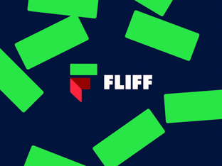
A brand to excite gamers, investors and talent. We distilled the brand strategy and elevated the visual identity for this social sportsbook startup.
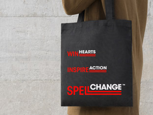
Impactful visual identity showing the power of clear communications. We designed a brand for a creative agency for charities and ethical businesses.
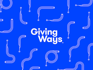
A flexible identity system with a meaningful name and fluid logo, designed to make the next generation excited about supporting charities.