YR
Always evolving the brand of a global, fashion-savvy software company. We are the brand transformation partner of the product customisation pioneer.
CreateMe, a San Francisco Bay Area startup, is revolutionising apparel manufacturing. Focused on cutting-edge research and development, they are leading the charge in automation to make manufacturing smarter and more sustainable.
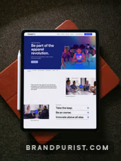
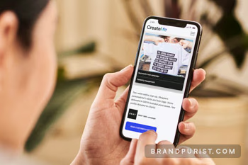
We consolidated their brand and created a unified design system across key touchpoints.
“I had the pleasure of collaborating with Bence and his company, Brand Purist, on rebranding the website for CreateMe. I couldn’t have been happier with the results. Bence is incredibly talented, with a true passion for branding and design.”
CreateMe has evolved rapidly in a short space of time as startups often do. Acquiring YR to bolster its product customization offering created a need to update the brand messaging and visual identity.
We introduced an endorsed brand architecture with the newly acquired brands under CreateMe. Combining the YR logo with the strapline ‘by CreateMe’ establishes a clear hierarchy visually and boosts the parent brand’s recognition.
Collaborating closely with CreateMe’s marketing team, we defined a new tone of voice and distilled key messages for the website. The language needed to be action-oriented, reader-centric, concise and impactful.
We emphasised customisation to resonate with potential clients and drive sales. Automated manufacturing was also prominently featured to reflect CreateMe’s future-focused vision and long-term roadmap to investors.
Learn more about our brand messages service“Bence is also a fantastic project manager. He kept everything running smoothly and efficiently, even under impossible deadlines. And you can trust that the entire team at Brand Purist will deliver top-notch work while making the whole process seamless.”

Creating a design system that is both easy to use and maintain was our primary focus. We analysed existing visual assets to learn about how the CreateMe team used them. This helped set rules to avoid inconsistencies, which often arise when multiple individuals handle design within a large organisation.
Learn more about our visual identity serviceWe developed the site in Webflow because it enabled us to move rapidly from design to deployment. Webflow also lent itself to creating fluid interactions and animations.
Learn more about our web design service
To support the sales team, we also conducted a presentation design sprint. We defined a clear colour hierarchy, typography rules, spacing guidelines, and image treatment options for design consistency.