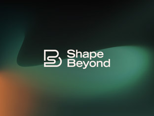
Shape Beyond
Reshaping the preconceptions about consultancy. We partnered with business transformation experts to create a mould-breaking, dynamic brand.
ICON Printing, a custom branded clothing company, reached out to Brand Purist to develop a vibrant and coherent brand identity.
Following an immersive branding process, we reinvigorated ICON’s brand by focusing on design, quality and serving the creative industry.
“Our rebranding has been a huge undertaking – one which has required us to rethink how everything from our logo and stationery look to the design of the website. But we couldn’t be happier with the results.”
The analysis of the highly saturated branded clothing sector revealed opportunities for ICON Printing.
Competitors’ brands felt generic. As they were trying to target a wide audience, they failed to resonate with any particular group. ICON Printing could stand out by truly speaking to the challenges of customers.
In addition to competitor research, we visited printing facilities and conducted surveys that highlighted ICON’s strengths. Their excellent customer service and attention to detail in printing frequently featured in feedback.
Learn more about our brand research serviceThe objective of the rebrand was to identify and express what ICON Printing, as a business and brand, stood for.
The renewed brand had to be impactful and memorable, to get people noticing and talking about ICON. It also had to be a brand that audiences would want to associate with, and even wear clothing featuring its logo.
The brand ethos of ICON Printing was summed up in three core values: Progressiveness, Proactivity and Agility. These ideas provided the foundation for the brand, influencing all of its facets and touchpoints.
Learn more about our brand strategy serviceDynamism, modernism, flexibility and clarity were the guiding principles for the visual direction.
Our goal was to create a stand-out look, with bold elements and unique details. The colour palette was selected for its distinctiveness from competitors and appeal to designers and creatives. Avenir Next, a modern classic with a geometric, yet human-centric style, was chosen as the brand typeface.
Learn more about our brand design serviceWe designed a typemark for ICON Printing that features a diagonal rectangle replacing the letter "O" in the name. This slanted shape was inspired by tools used to spread paint as part of the screen printing process. It represents a blank canvas for creativity, acting as a frame for images and videos.
Learn more about our logo design serviceZooming in on the logomark, we created distinct patterns and artworks. These brand expressions are integral to the visual identity across print, digital and motion graphics.
Learn more about our visual identity serviceAfter our design solution was approved, we moved on to delivering the final assets for a full brand launch.
The core part of this work was redesigning the e-commerce platform of ICON Printing to match the new brand. We photographed various printing processes and details of items to emphasise craftsmanship. We also generated thousands of product photos to bring consistency to ICON’s website.
Learn more about our brand implementation serviceThe website redesign was an extensive exercise, covering the product catalogue, item customisation, order process, and many content pages. All page layouts follow one clear grid system. Large headlines in the brand’s distinct green colour are combined with high quality large images for visual impact. We liaised closely with ICON’s chosen web developers to ensure the final product was true to our designs.
Learn more about our web design serviceWe partnered with production studio Haus Pictures to create four short brand films, each showcasing a different production method. Animated graphic artworks of the brand’s signature design elements complement the videos.
We captured the printing and embroidery processes at ICON’s facilities and took close-up shots of high-quality, finished products. The images have fashion and lifestyle aesthetics to bring creative audiences closer to the brand.
Learn more about our photography serviceAs each clothing manufacturer had their own unique style of product photos, ICON’s online catalogue was an eclectic mix of images. We introduced consistency by creating thousands of product images following a unified aesthetic.
Reshaping the preconceptions about consultancy. We partnered with business transformation experts to create a mould-breaking, dynamic brand.
An international identity that reflects partnership, team spirit and sports. We worked with gaming industry veterans to launch their tech startup brand.

Always evolving the brand of a global, fashion-savvy software company. We are the brand transformation partner of the product customisation pioneer.
Impactful visual identity showing the power of clear communications. We designed a brand for a creative agency for charities and ethical businesses.