Fliff
A brand to excite gamers, investors and talent. We distilled the brand strategy and elevated the visual identity for this social sportsbook startup.
One Small Pixel harnesses storytelling, design and technology to create experiences, animations and films that fill audiences with excitement.
Our job was to reignite the brand’s spark by sharpening the values, injecting creativity into the messaging and energising the visual identity.

One Small Pixel produces work for some of the world’s biggest brands. These brands want to resonate with their customers by sparking their interest through entertaining, informative or inspiring content.
Learn more about our brand research service
The brand’s ‘Why?’ was answered through a collective effort – to push for the unexpected by creating experiences that move. This statement captures One Small Pixel’s relentless pursuit to challenge creative boundaries and solve visual problems in new ways. Their aspiration is to enrich people’s lives through emotionally engaging stories and memorable moments.
Learn more about our brand strategy serviceIn close collaboration with One Small Pixel, we developed a messaging framework to set out the brand’s verbal identity, including tone of voice, style and character. The three pillars that this framework rests upon are influenced by the core values:
Establishing key messages prior to the design phase can be beneficial. In this instance, the concept of ‘Pushing for the unexpected’ directly inspired our design approach. Capturing the energy and mystery embodied by this phrase felt appropriate.
Learn more about our brand design service
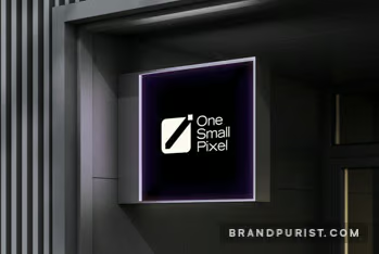
While the original logo mark was effective in its simplicity, it felt static. Instead of allowing the large square to overshadow the small pixel, we reimagined it to depict the small pixel pushing through the large one. We rounded the corners of the large square to make the logo feel friendlier.
The length of the name posed some challenges but placing the words on three separate lines helped us achieve a more balanced look and cleaner appearance.
The colour palette and typeface play a significant role in shaping brand perceptions. The font has distinctive style and elegance. The dark background, complemented by hints of colour, symbolises the unknown, where One Small Pixel serves as a guiding light. The purple and pink gradients add depth. And the green adds a bit of quirkiness.
The logo mark’s rounded corners were carried over to the rest of the visual identity to modernise the brand and create a cohesive look. The energetic small pixel was also made a prominent part of the visual identity. The pixel can gain its own personality through animations and interactivity.
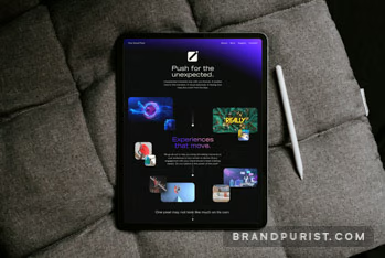
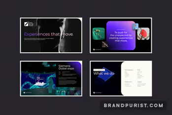
Learn more about our visual identity serviceWe provided guidelines to help the One Small Pixel team begin the rollout. We created web design concepts and slide templates to set out a clear direction.

One Small Pixel’s brand book perfectly encapsulates their creative spirit. It captures the brand’s identity, including its purpose, values, and messaging framework. It establishes guidelines for visual elements such as the logo, colour palette, and typography. As One Small Pixel continues to push design boundaries, this document will ensure their brand remains cohesive and recognisable.
Learn more about our brand guidelines service