Reading Mate
Branding an edtech startup on a mission to give every child the best chance in life. Aligning the team along a single vision. Creating a brand worthy of their cause.
Sorel Point is a Jersey-based independent specialist insurance advisor to offshore financial services intermediaries and family offices.
We helped crystallise the vision and launch a distinct and credible brand at speed.

“Each stage of the brand sprint process was well defined and my time and expectations were managed expertly throughout. From the outset, Bence emphasised that a good brand is more than a visual identity, and the various workshops helped me to think clearly about my mission, values, tone of voice and messaging, as well helping me to actually shape the design brief for Bence and his team.”


Dissecting local and global competitor brands revealed that many were dated and incoherent. The ones that resonated better had clean, professional visuals and clear, customer-centric messages.
The target audiences – fiduciary, legal and financial service providers – face complex risks and liabilities. Helping them requires a deep understanding of their challenges. There’s no one-size-fits-all answer in this niche insurance market.
Learn more about our brand research service“We disrupt the perceptions of insurance by placing relationships at the heart of it.”
This point of difference was key to reflect on the identity. The view that insurance as a force for good can enable people to take risks and innovate led us to the core purpose: to give people the certainty they need to pursue their ambitions.
Learn more about our brand strategy serviceOur design brief outlined a reliable brand but with a fresh perspective. We chose colours to reflect this: navy blue to signify trust, a vibrant blue and yellow to add a little twist. Since the brand is named after a geographic location on Jersey’s northern coast, it made sense to incorporate imagery of this dramatic scenery into the brand.
Learn more about our brand design serviceWe settled on an ‘S’ symbol resembling links of a chain. The two parts of the ‘S’ interlock into each other and surround a diamond to represent partnership and protection.
Learn more about our logo design service
“I was very happy with the initial brand concept, but Bence took me through a very well structured critique process, resulting in identifying a number of areas for further refinement and an excellent final concept which fitted my brief perfectly - all completed within 3 weeks.”

We swiftly rolled out the brand by focusing on digital deliverables: website, social media designs, e-signatures and slide templates.
Due to our strict timelines, we initially planned to have only simple icons and illustrations to round out the brand. However, the founder provided photography that significantly energised the visual identity.
Learn more about our brand implementation serviceThe website takes advantage of photos of Jersey’s coast, and graphic artworks derived from the logo mark. Reader-centric, bold messages are a staple of the brand.
Learn more about our web design service
We produced a range of slide templates as part of the initial brand implementation.


For Sorel Point, we crafted a brand book that reflects their coastal elegance. It includes the brand’s core identity, values and personality. It also covers detailed guidelines for logo, colour palette, and typography. This document will serve as a lighthouse for Sorel Point’s brand as they navigate the tides of the market.
Learn more about our brand guidelines service
Branding an edtech startup on a mission to give every child the best chance in life. Aligning the team along a single vision. Creating a brand worthy of their cause.
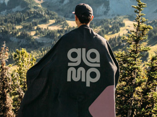
Creating an adventurous brand with community at its heart. Disrupting the preconceptions of glamorous camping and appealing to a young, eclectic audience.
Creating a brand for a US-based tech recruiters committed to uniting people for success. Capturing this new venture’s aspirations through strategy and design.
Reigniting a creative studio’s spark by sharpening brand values, producing inventive messaging and energising the visual identity.