
Playfilled
Shifting beliefs around play. We created a fluid visual identity to express playfulness and resilience for an experimental people consultancy.
We designed the brand of a creative agency specialising in charity and ethical business marketing. Together, the name and visual identity express the idea of clear, impactful communications underpinning positive change.

“Such an inclusive and rewarding process. Brand Purist helped me make sense of my aspirations, then transformed them into a coherent, striking brand. I love it!”

We analysed competitors and empathised with audiences. There are many creative agencies, but most don’t focus on charities and ethical businesses. Competitors’ brand designs are often subdued and safe, so we decided to aim for more impact.
Learn more about our brand research serviceSpell Change is founded on a clear mission of helping organisations move more people to drive more change. It’s a purpose that will resonate with the type of clients they want to attract. We also defined the brand personality, core values and desired positioning as part of the brand strategy.
Learn more about our brand strategy serviceWe set clear criteria before delving into name generation. The name needed to be meaningful, energetic and in line with the brand strategy. We worked with the founder to produce and shortlist options. ‘Spell Change’ captures the essence of the brand. It’s short, memorable and gives the company a sense of credibility, right from the start.
Learn more about our brand naming service
The brand name inspired our visual explorations. Spell Change’s core offering is creative copywriting and content development, so written language features in the brand design. We created a typographic visual identity that communicates the idea of elevating words and messages to maximise impact.
Learn more about our brand design serviceWe opted for a type mark logo design. The word SPELL visually underpins and lifts up the word CHANGE. It’s a simple and effective way to translate the brand’s purpose into a visual form, with no unnecessary flourishes.
Learn more about our logo design serviceThe double lines are the most recognisable feature of the logo. So we carried them into other elements of the visual identity like icons, text highlights, divider lines and hyperlinks. The vibrant red colour immediately grabs attention. And the classic red, black and white combination is unique within the competitive landscape.
Learn more about our visual identity service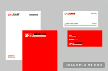
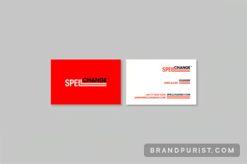
The brand sprint covered all the essentials for a small new business. The founder was equipped with a range of assets to launch the brand:

Spell Change can easily update and grow their website. The design allows the copy to breathe and create impact. The double lines help to create a cohesive look.
Learn more about our web design service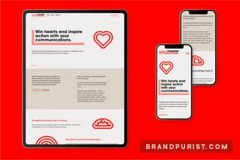
The brand book provides a summary of Spell Change’s identity. It also gives guidance on the visuals such as the logo, colour palette and typography.
Learn more about our brand guidelines service