Reading Mate
Branding an edtech startup on a mission to give every child the best chance in life. Aligning the team along a single vision. Creating a brand worthy of their cause.
Glamp is a marketing platform for the lovers of glamping. The term ‘glamping’ is a combination of ‘glamorous’ and ‘camping’. It’s a way of enjoying the great outdoors without sacrificing the luxury and comfort of a hotel. Glamp helps glampsite owners elevate their brands and reach more people.
We set out to create a brand that could disrupt preconceptions of glamping and appeal to a young, eclectic audience.

“Bence was extremely well organised and knowledgeable, giving his coaching and guidance input to the process to bring the team to a shared understanding of the new brand and an incredible new visual identity. We are very excited about where this can now take us and would very much recommend Brand Purist.”
The competitive landscape looked mostly very traditional. We had to look beyond the industry for inspiring brands that had the right ‘feel’.
Learn more about our brand research serviceThe driving force behind the brand became fostering the community of glampers and glampsite owners. It had to resonate with their genuine enthusiasm for glamping.
Learn more about our brand strategy service
Our brief was clear: avoid clichés and visual cues to glamping in the logo and find the right balance between disruption and credibility in the overall design.
Learn more about our brand design serviceThe look of the classic VW camper van was mentioned during an earlier chat. This planted the seed for the logotype design. The logo captures a retro, yet timeless feel with an inherent friendly character. The letters can be arranged on one line or two lines which lends itself to different usage, such as app icons.
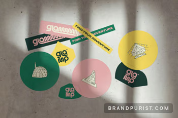
Learn more about our logo design serviceWe took inspiration from glamping pods, tents and yurts to create a set of simplified, abstract shapes. These act as design elements all throughout the different touchpoints. We also used actual illustrations of dwellings and people for icons on the website and on stickers for guerilla marketing concepts.
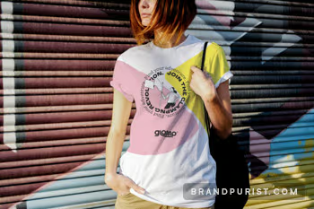
The colour palette is driven by pink and yellow to break down the outdoorsy stereotype and connect with the urban audience.
Learn more about our visual identity service


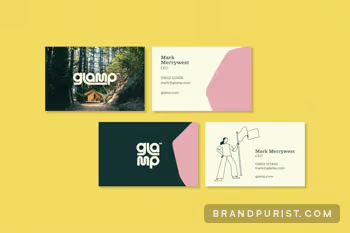
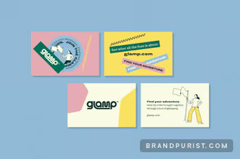
To wrap up the initial project, we provided guidelines to help the Glamp team implement the brand themselves. We produced web design concepts, social media templates, e-signatures, business cards and sticker designs to kickstart the brand.
Learn more about our brand implementation serviceGlamp’s essence is captured in their brand book that covers their purpose, values and unique personality. It also contains guidelines for logo, colour and typeface usage to ensure a consistent and memorable representation. This document will guide Glamp’s branding as they redefine outdoor holidays.
Learn more about our brand guidelines service