CreateMe
Shaping the brand of an on-demand apparel manufacturing startup. We consolidated their brand and created a unified design language.
ViB Community empowers tech professionals to discover curated software solutions in an unbiased, structured way.
We collaborated with the US company to create a distinct and inspiring brand that can earn the trust of their discerning B2B audience.

“The sprint consisted of thoughtful exercises and discussions that led us to branding that complements our corporate brand yet creates distinction. Bence was receptive to our feedback and we are happy with the result. I recommend the brand sprint process to anyone who needs a brand identity or branding overhaul in a short amount of time.”
To understand the competitive landscape, we analysed the visual and verbal languages of brands offering variations of tech professional networks.
We focused on identifying what resonates with ViB Community’s target demographics of IT decision-makers, including developers, CIOs, VPs, and Directors of IT. Through empathy mapping of various tech personas, we uncovered their pain points and aspirations. They craved a trusted platform that streamlined software selection, eliminating marketing fluff and empowering confident, high-stakes decisions.

ViB Community is a sub-brand of the larger ViB brand — a business-to-business lead generator for software companies. The objective was to create a community brand that not only complements the parent brand but also stands out with its unique identity.
Before delving into the design phase, collaborative workshops with the ViB Community team crystallised the brand’s core values, personality, and a defining purpose statement: “We create the most effective tech buying experiences.” This purpose grounds the brand in a clear mission that connects with all stakeholders.
Learn more about our brand strategy service
The primary challenge outlined in the design brief was to encapsulate the essence of a brand that is both direct and efficient, yet inspiring. The overarching design needed to evoke a sense of relief, assuring audiences that they are in the right place to navigate serious and potentially stressful purchasing decisions.
The brand values and personality traits guided the visual direction by influencing font, colour and artwork choices. The proposed designs leverage ample white space to emphasise transparency and efficiency. A palette of greens serves to instil trust, embodying the brand’s dependable and validating nature. The use of purple conveys a sense of directness, capturing a proactive attitude and acting as a clear call to action.
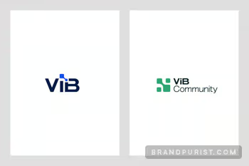
Learn more about our brand design serviceThe logomark’s rounded squares represent members of the network. Overall the mark symbolises how the ViB Community efficiently connects tech buyers and vendors.
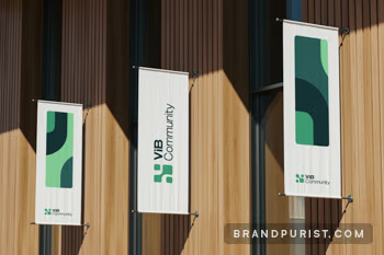
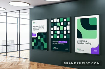
The logomark serves as a building block for creative applications. Zoomed in, it creates abstract artwork, while repetition across grids reinforces the network concept. Its organic form expresses the dynamic and evolving nature of the community.
Learn more about our visual identity service

To meet the lean project scope and tight schedule, we prioritised essential design assets and guidelines. We provided designs for the community’s website and membership platform to show how the brand could work on these key digital touchpoints.
Learn more about our brand implementation serviceThe ViB Community’s brand book summarises the foundations of the brand identity, including the brand purpose, core values, and personality. It also outlines clear guidelines for logo, typography and colour usage. This document will serve as a crucial reference for maintaining brand consistency as the community expands.
Learn more about our brand guidelines service