Huddle
An international identity that reflects partnership, team spirit and sports. We worked with gaming industry veterans to launch their tech startup brand.
We partnered with business transformation expert Helen Ashton to create a mould-breaking, dynamic brand for her new company. The brand conveys the idea of nurturing and evolving businesses in an ever-changing landscape.
The key building blocks were originally created through our brand sprint process but the brand has been expanded since then.
“Absolutely loved going through the Brand Purist brand sprints. What a great idea with a superb outcome. I’m looking forward to working together in the coming years.”
“No unnecessary chat. No unnecessary debate. Just decisive, professional and output focused. And I enjoyed every minute and couldn’t be prouder of our brand which represents what we do so well. If you are up for a rebrand - this in my opinion is the way forward.”
Our project began with an extensive, open-ended discussion about the business’ future plans, followed by a brand research workshop. During this workshop, we dissected competitors’ brands and delved into the specific needs of various target audiences.
The research phase did not provide all the answers, but it crystallised our understanding of the market needs and the competitive landscape. Analysing existing brands further clarified which strategic paths to avoid and which to pursue.
Learn more about our brand research serviceIn the highly competitive business consultancy landscape, distinguishing oneself is a formidable challenge. We identified a brand positioning opportunity in the founder’s unique blend of expertise in fostering culture change alongside achieving financial results. This led to the creation of a brand that harmoniously integrates emotional intelligence with IQ, encapsulating this dual emphasis.
Learn more about our brand strategy service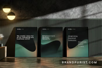
Establishing a consultancy committed to more than just growth — making a meaningful societal impact — was vital for the founder. Shape Beyond’s purpose is to reshape the business world to create value for all.
Learn more about our brand purpose serviceChoosing the right name demanded strict criteria and deadlines. Resulting from a team effort, ‘Shape Beyond’ expresses the idea of shaping businesses, while going beyond expectations. It also captures the concept of nurturing future business leaders.
Learn more about our brand naming serviceThe design phase kicked off with idea generation, gathering inspiration and crafting a straightforward design brief. The founder played a crucial role in setting the visual direction, while our team focused on integrating these insights into a cohesive, simple, yet meaningful design solution.
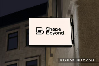
The integration of the letter ‘B’ beyond ‘S’ and its nurturing embrace around ‘S’ using round, welcoming forms, adds a layer of warmth and care to the brand’s identity. Achieving such a rich narrative within a logo is challenging, yet it reflects our commitment to blending simplicity with meaningful depth in our designs.
Learn more about our logo design serviceThe logo was only the beginning of the visual identity. The colour palette was selected to reinforce the concept of nurture and nature, utilising colours that evoke a sense of warmth and growth. Organic shapes, inspired by the logomark’s fluidity, serve as dynamic brand expressions. They capture the evolving essence of today’s never normal world.
Learn more about our visual identity service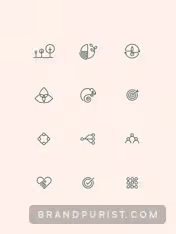

Our continued partnership involves offering strategic branding advice, crafting compelling brand messaging, and providing ongoing design services.
Learn more about our brand implementation serviceIn close collaboration with Shape Beyond, we crafted a verbal identity that defines the brand’s personality, voice, tone, style and character. This framework also forms the foundation of the content marketing strategy, structured around three key pillars: Drive Evolution, Adapt at Pace, Nurture Empowerment.
Learn more about our brand messages serviceThe website for Shape Beyond was developed iteratively, ensuring it perfectly aligns with the agency’s evolving business needs. In addition to design and development, we carefully crafted the site’s messaging and provided copywriting services to create the key pages. We also designed a range of icons using singular lines to complement the logo and embody the brand’s minimalist aesthetic.
Learn more about our web design service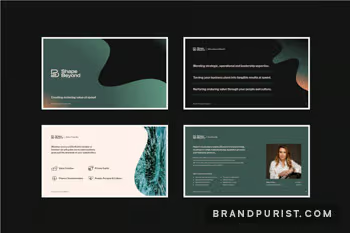
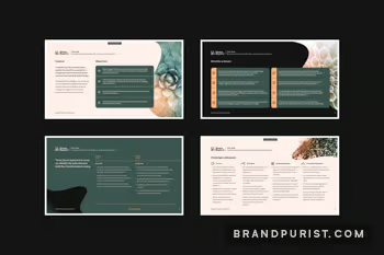
We designed an extensive suite of presentations and reusable slide templates for Shape Beyond, ensuring brand consistency and visual quality.
The brand’s visual narrative includes photography of organic, evolving forms and abstract patterns. We assembled a library of images, systematically organised by themes and topics, to add visual interest and depth to presentations and articles.
Learn more about our photography serviceWe shaped the direction of a series of brand films, showcasing Helen Ashton and her new agency, Shape Beyond, to the world.
To enrich video content and boost social media marketing, we created a range of animations, enhancing the brand’s digital presence.
Shape Beyond’s brand book is the definitive guide for both team members and external partners working with the brand. Initially comprising a few pages on brand values, logo usage, colours and typography, it has grown into an extensive document. With the inclusion of messaging frameworks, detailed guidelines, and design instructions, the brand book has become an invaluable resource that supports the business’ growth.
Learn more about our brand guidelines service